Designed for Art, Built for Community
A digital platform built to serve donors, volunteers, and community
The Riverside Art Center’s website is essential for promoting fine arts and connecting with the Wapakoneta community, but its outdated design hinders navigation, accessibility, and engagement. Our redesign creates a responsive, modern platform that improves usability and better serves donors, volunteers, and the public.

I set out to redesign the Riverside Art Center website with a responsive, modern layout that works seamlessly across devices. My approach focused on streamlining navigation, improving accessibility, and showcasing events and exhibitions in a visually engaging way. The result is a user-friendly platform that strengthens community connection and encourages greater involvement.
I restructured the site to put key actions front and center: donating, signing up for membership, and browsing events. The navigation needed to be intuitive for everyone from first-time visitors to regular donors. I mapped out user flows to reduce friction and make sure people could get to what they needed without hunting through menus.

The visual refresh needed to feel creative without being chaotic. I used clean layouts, strong typography, and a flexible color palette that captures the vibrancy of local arts while staying professional. The goal was to appeal to both artists and the general public with something that felt welcoming to everyone.

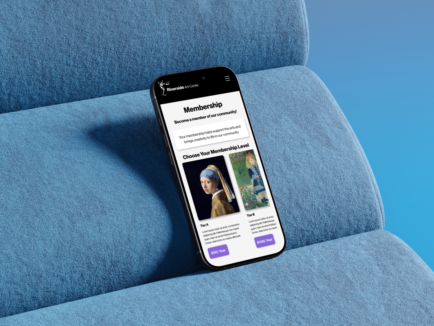
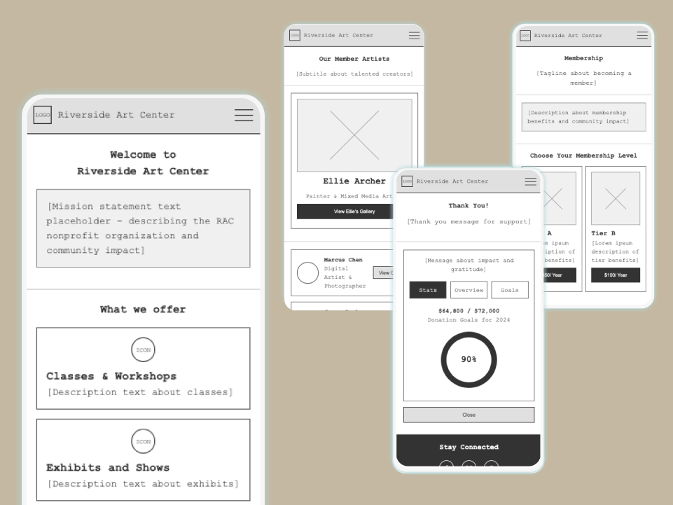
I started with wireframes to reorganize the content into something clearer and less overwhelming. The old gallery was scattered, so I moved to organized card layouts that highlight individual artworks and artist profiles. Navigation was restructured to make donations and sign-ups easy to find from anywhere on the site.
The interface uses a bold card layout to break content into digestible sections. I integrated subtle gradient branding throughout to guide attention to important areas without making things feel busy. The design needed to be intuitive so people could move through tasks without thinking too hard about where to click next.
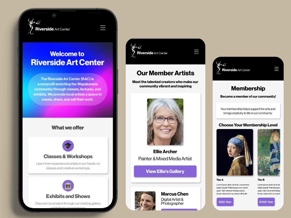
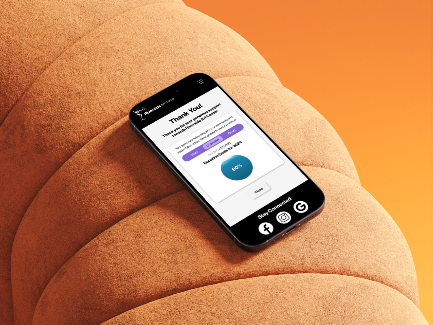
Since this is a nonprofit, donations and memberships are integral to the organization. I designed these flows to be as straightforward as possible with clean layouts, clear input fields, and visual progress indicators that show donation goals. The confirmation screens reinforce trust and transparency. It needed to feel professional but not cold, so people feel good about contributing.

The gradient aesthetic became a defining element, but I used it carefully. Gradients draw attention to key interactions like donation prompts and membership CTAs without overwhelming the page. It's a balancing act with enough visual interest to make things feel modern and inviting, but not so much that it competes with the content.
Everything in the design prioritizes making financial support easy. The navigation is clear and direct, the layouts emphasize readability, and users can quickly understand their options. Since Riverside is community-driven, removing friction from these actions was the most important thing I could do.
Engagement Features
Beyond donations, the app includes features for browsing events, exploring artist highlights, and previewing galleries. I designed these with the same visual hierarchy principles: clear, intuitive, and enjoyable to use. Subtle animations and consistent iconography help guide users through secondary content without distraction. These features add depth but maintain the same straightforward approach as the primary functions.