A calmer way to track meditation and journaling.
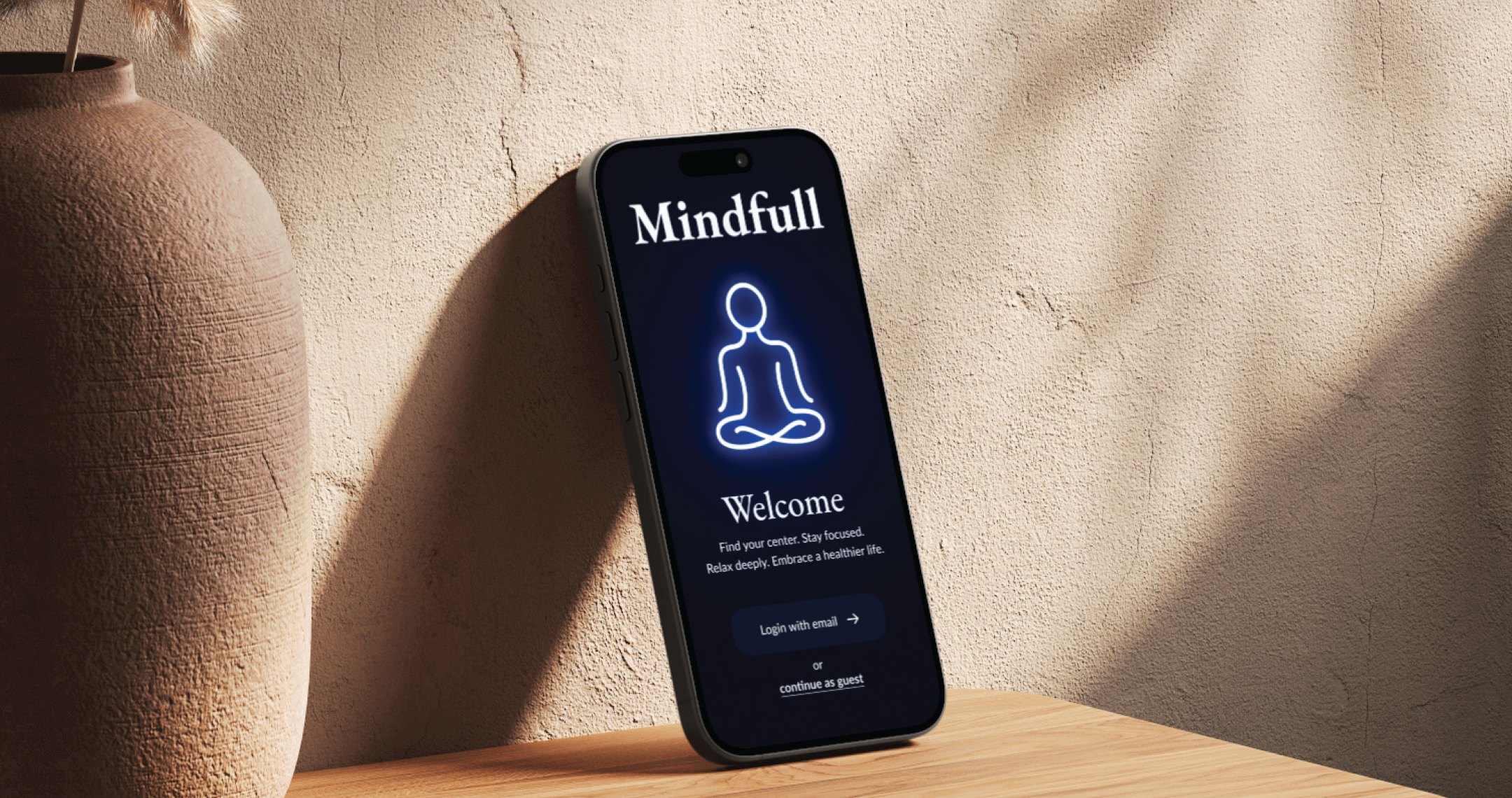
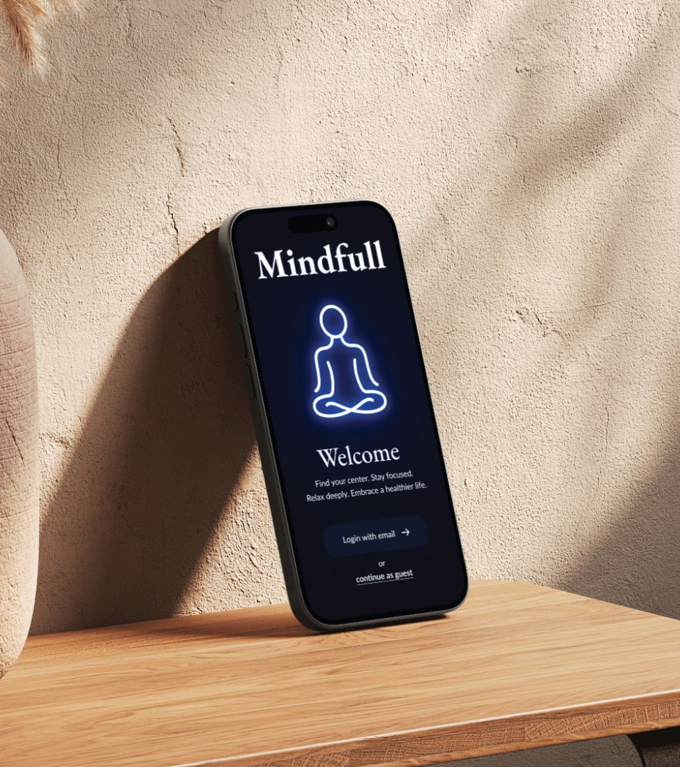
A gentler way in
Most wellness apps assume you already know how to meditate, so beginners rarely stick with it. Mindfull meets people where they are, with guided sessions, quick check-ins or a quiet place to write.
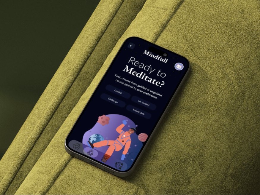
What makes people quit
I interviewed and surveyed young adults dealing with daily stress and constant digital noise. What kept them coming back came down to three things.
Easy to start
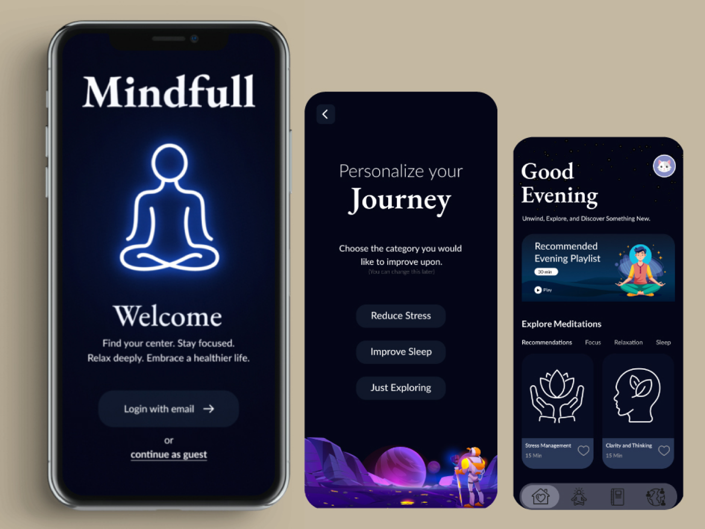
Onboarding asks one thing: reduce stress, sleep better or just explore.
No guilt
A skipped day shouldn’t feel like failing, so nothing counts against you.
Fits the day
Check-ins and sessions short enough to fit a busy schedule, not the other way around.
Three hubs, one tap away
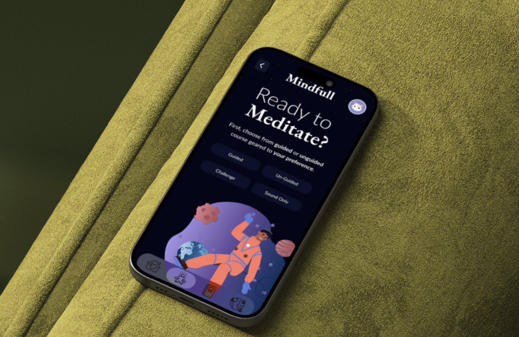
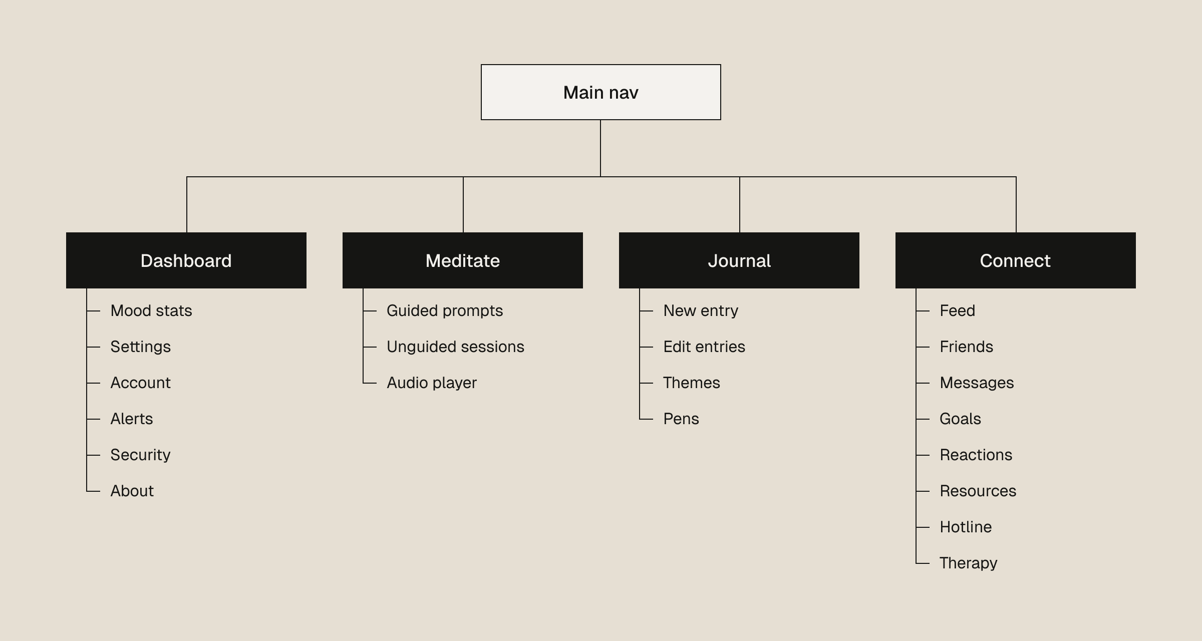
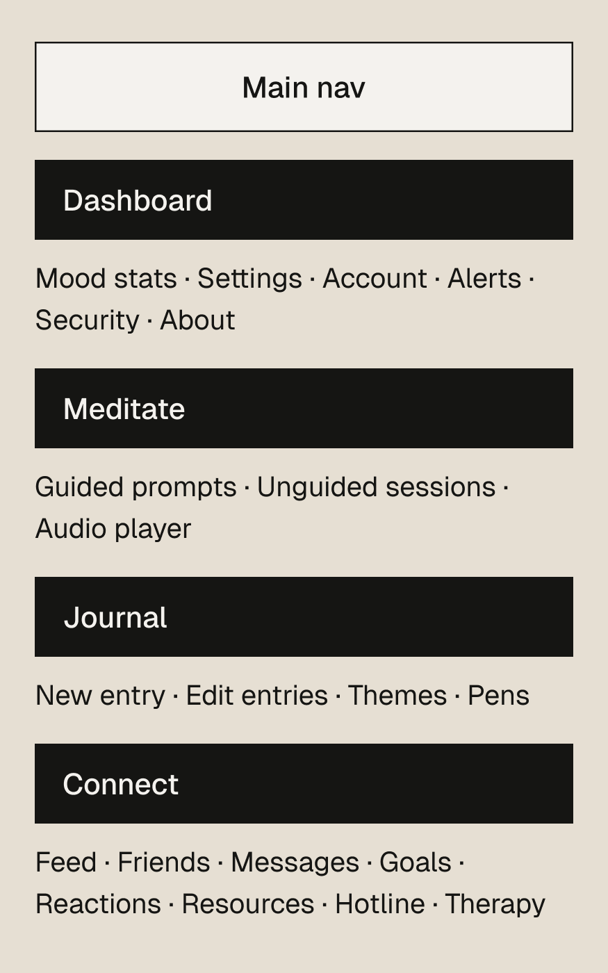
Meditation, journaling and community each get a hub off the main nav, so regulars jump straight in and first-timers never hunt through menus.
Quiet, not sterile
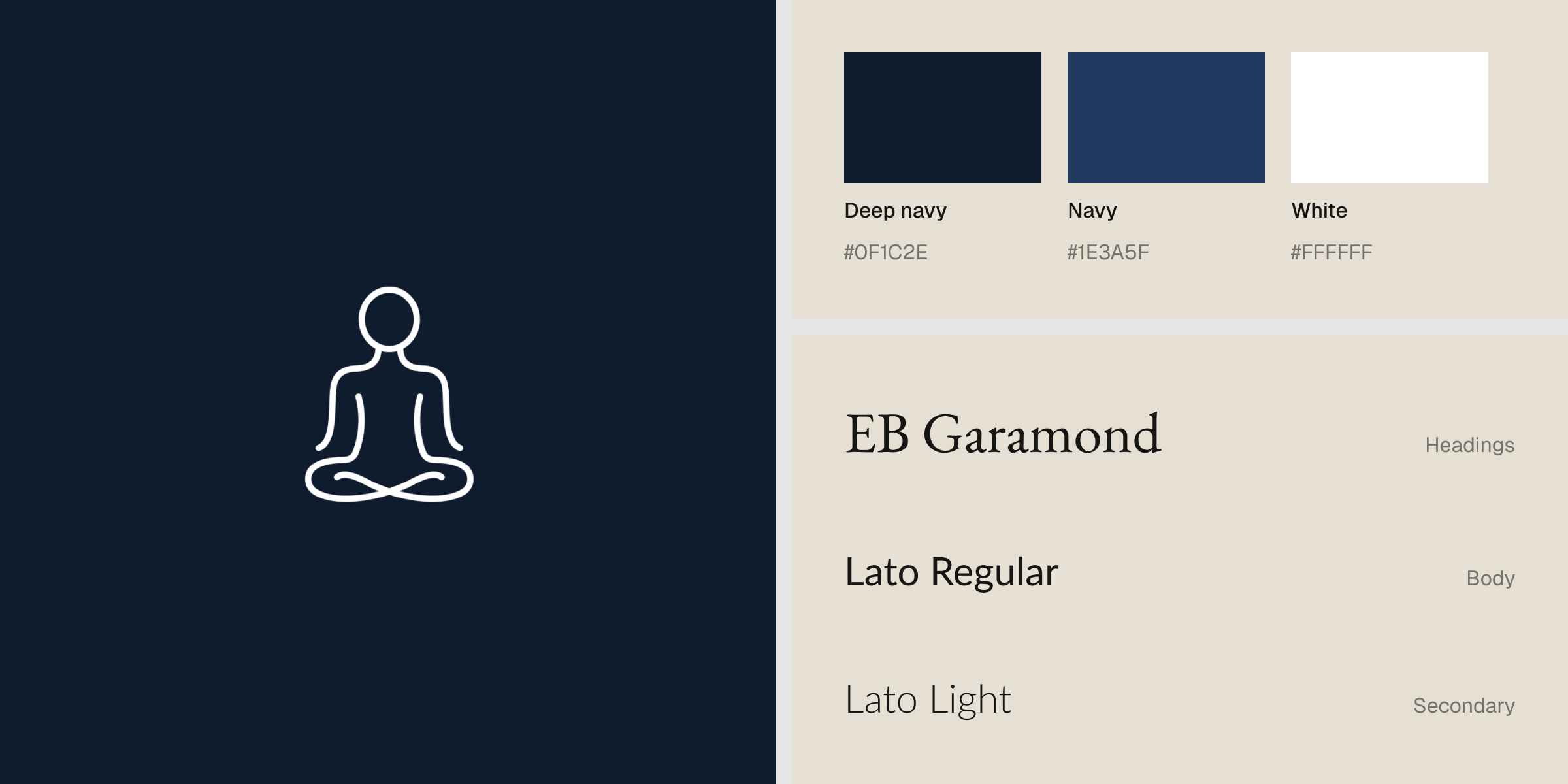
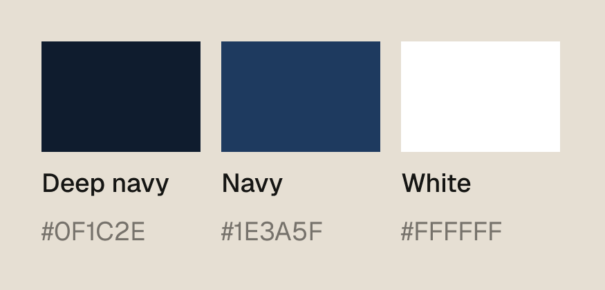
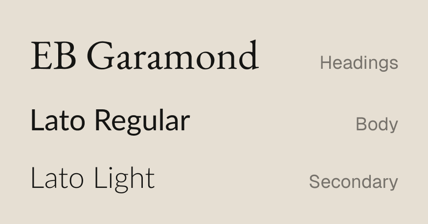
Deep blues and off-whites in low contrast, with EB Garamond for headings and Lato for everything else. It’s meant to feel like a break from typical app screens.
Wireframes first
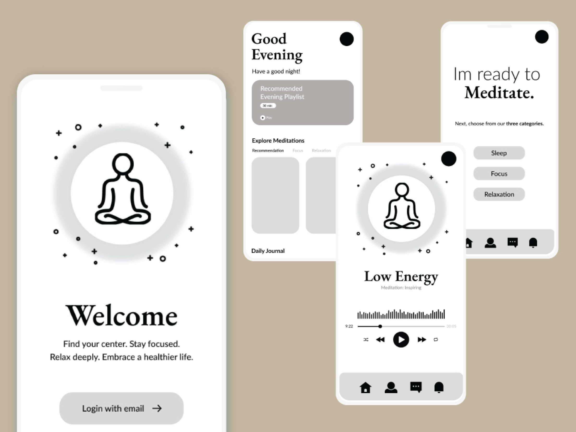
Low-fidelity wireframes mapped onboarding, mood check-ins and picking a session. I tested layouts quickly and kept whichever one removed a step.
Then the warmth
Illustrations, mood-based visuals and small animations gave the structure some personality, so it feels supportive instead of clinical.
Play, pause, write
The player sticks to play, pause and save. The journal gives you a background you choose and a page without formatting in the way.
Small calls that shaped it
Where it stands
A full UX case study covering onboarding, the dashboard, guided meditation and journaling.