Product Experience Redesign

Unifying a Fragmented Buying Experience
CGX's catalog was split across two sites, the legacy CGX Systems site and the newer CrunchBox Store. A buyer might find specs on one and pricing on another.The contact page stacked forms with no clear path. The footer was a flat link dump with no hierarchy. For scientific equipment buyers making considered purchases, that friction cost trust.

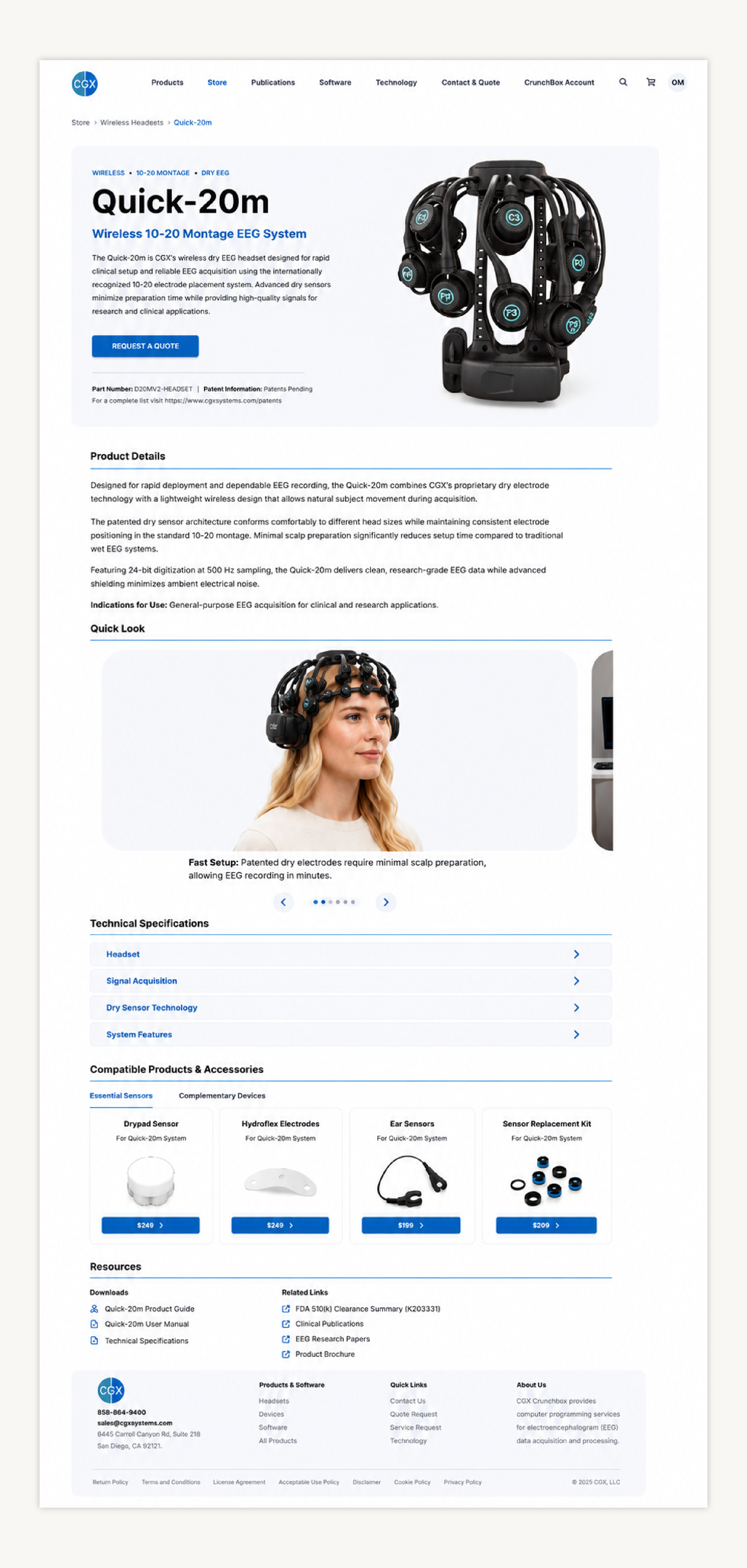
Merged scattered content, descriptions, specs, features, into one page per product, built on CB Store's real design system. Bigger product photography with key specs surfaced immediately, so buyers get oriented before they scroll.
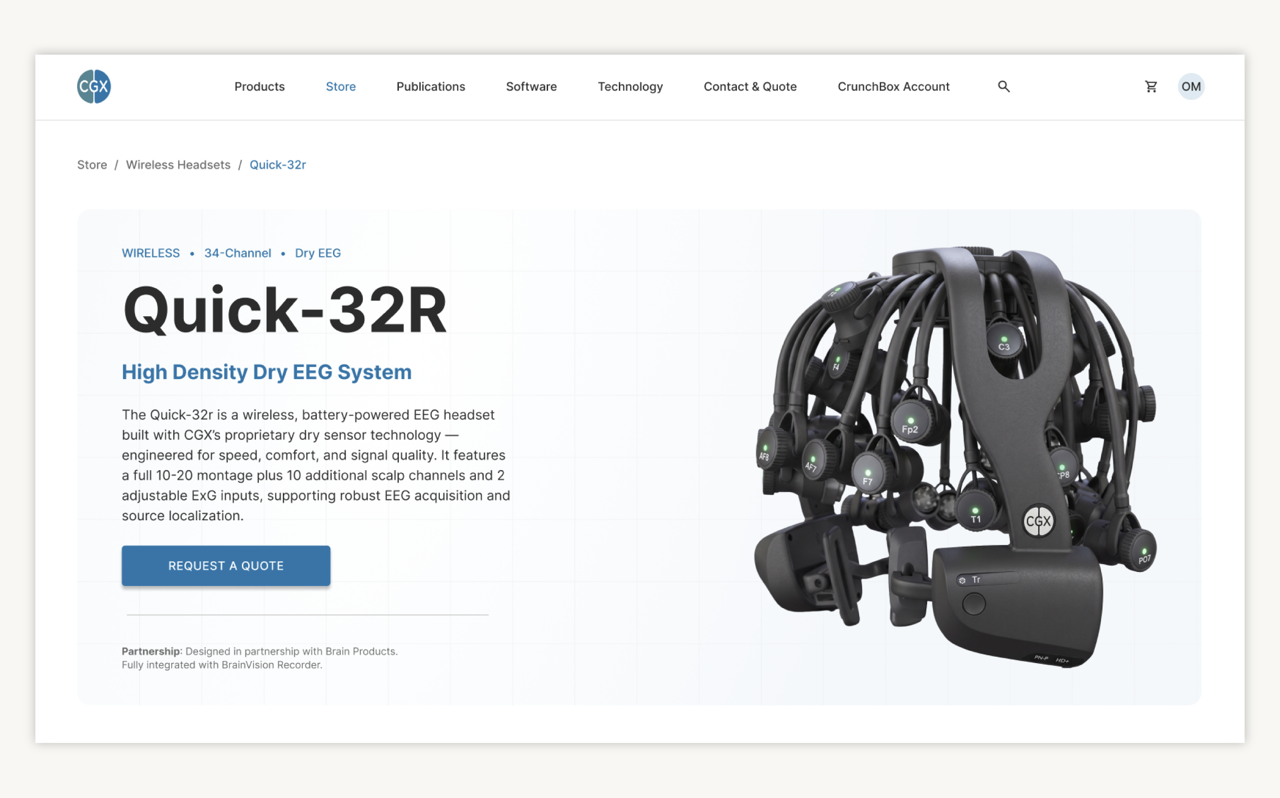
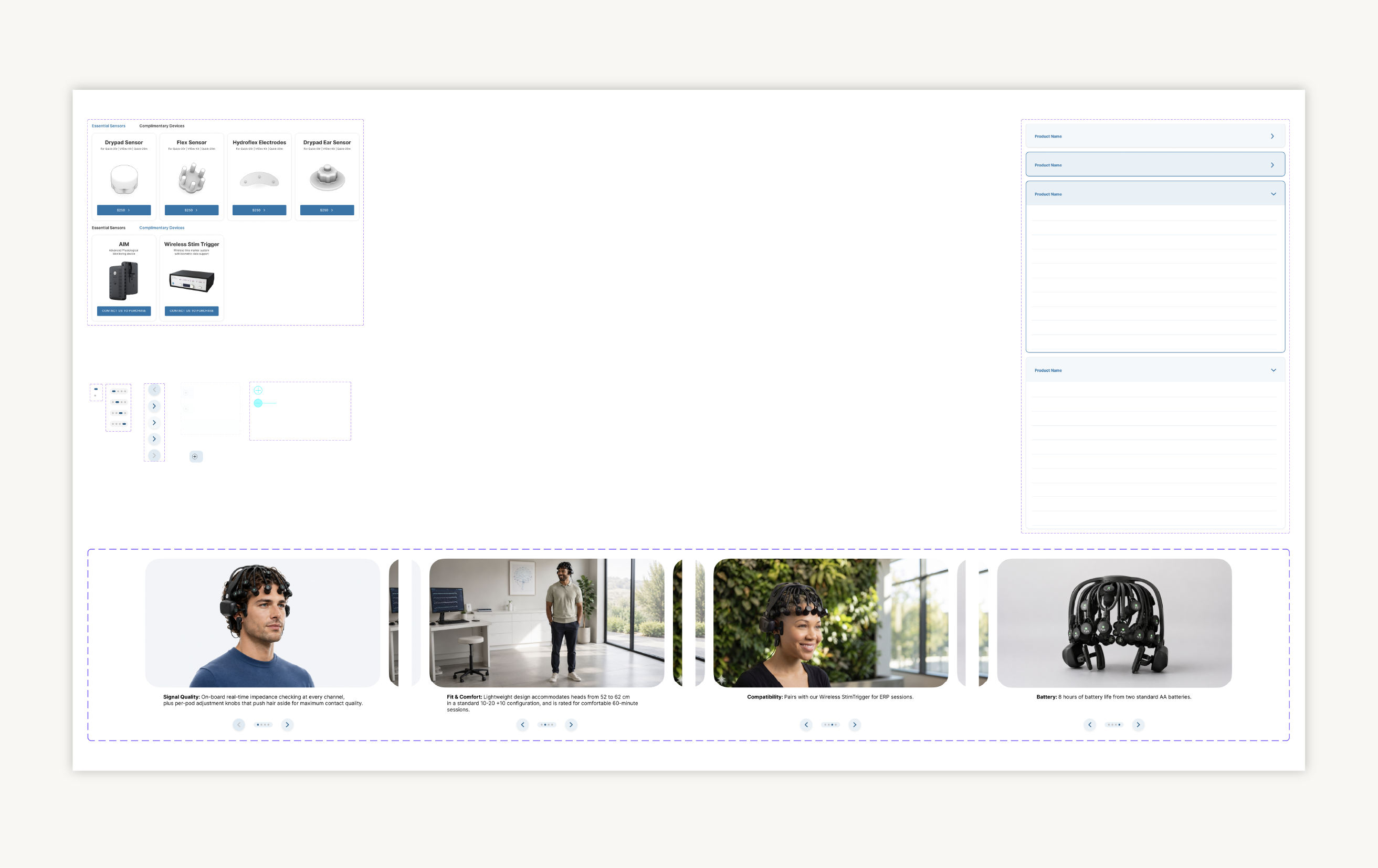
The gallery consolidates and automates the user experience of the product by being informative and more visually immersive at the same time. Shots include technical product photos and lifestyle images.
The important specs, sampling rate, resolution, channel count, condensed into a single accordion so dense data stays organized and scannable, not overwhelming.

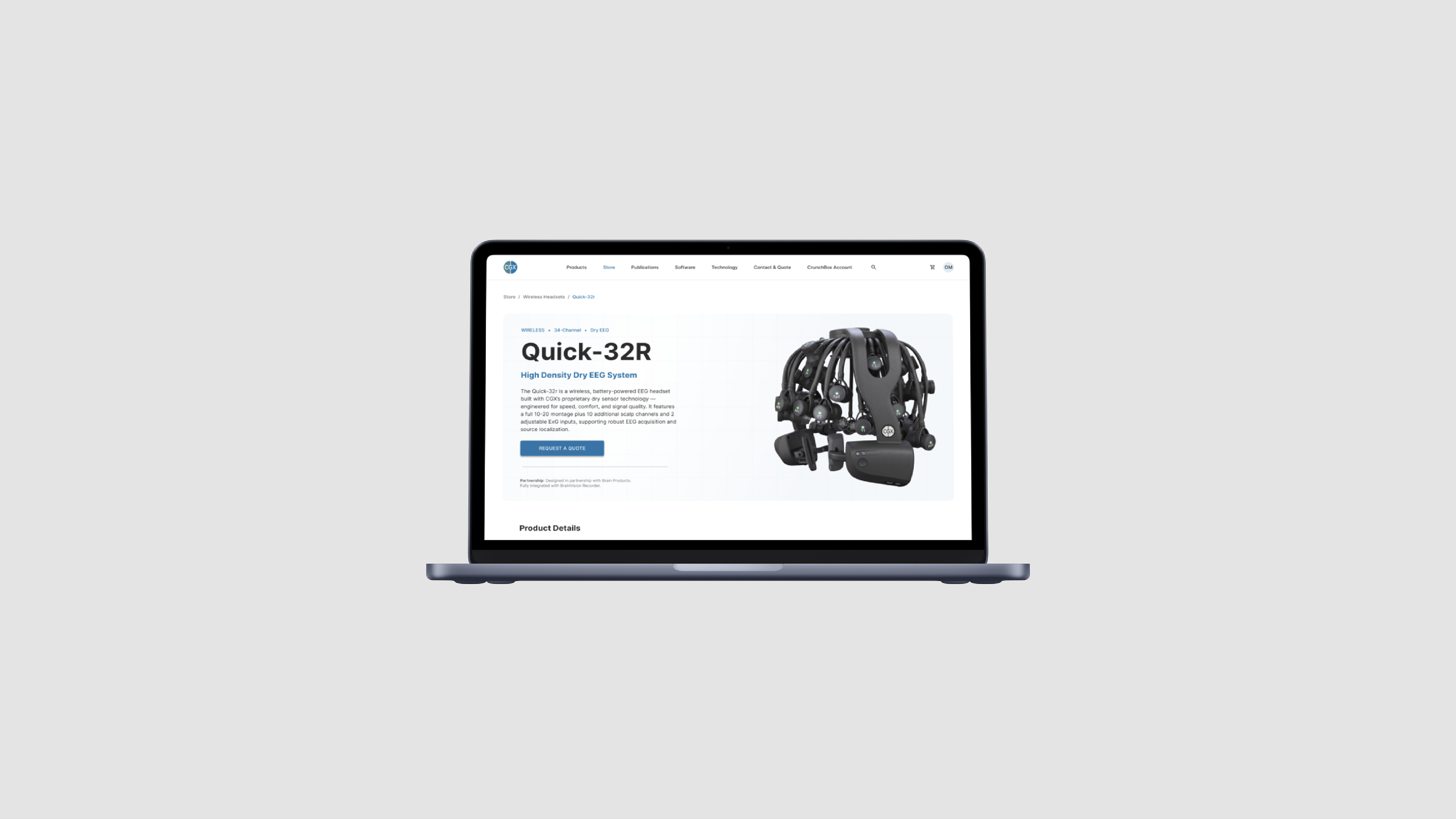
A cross-sell grid surfaces compatible sensors and devices, so buyers discover complementary gear without leaving the page.
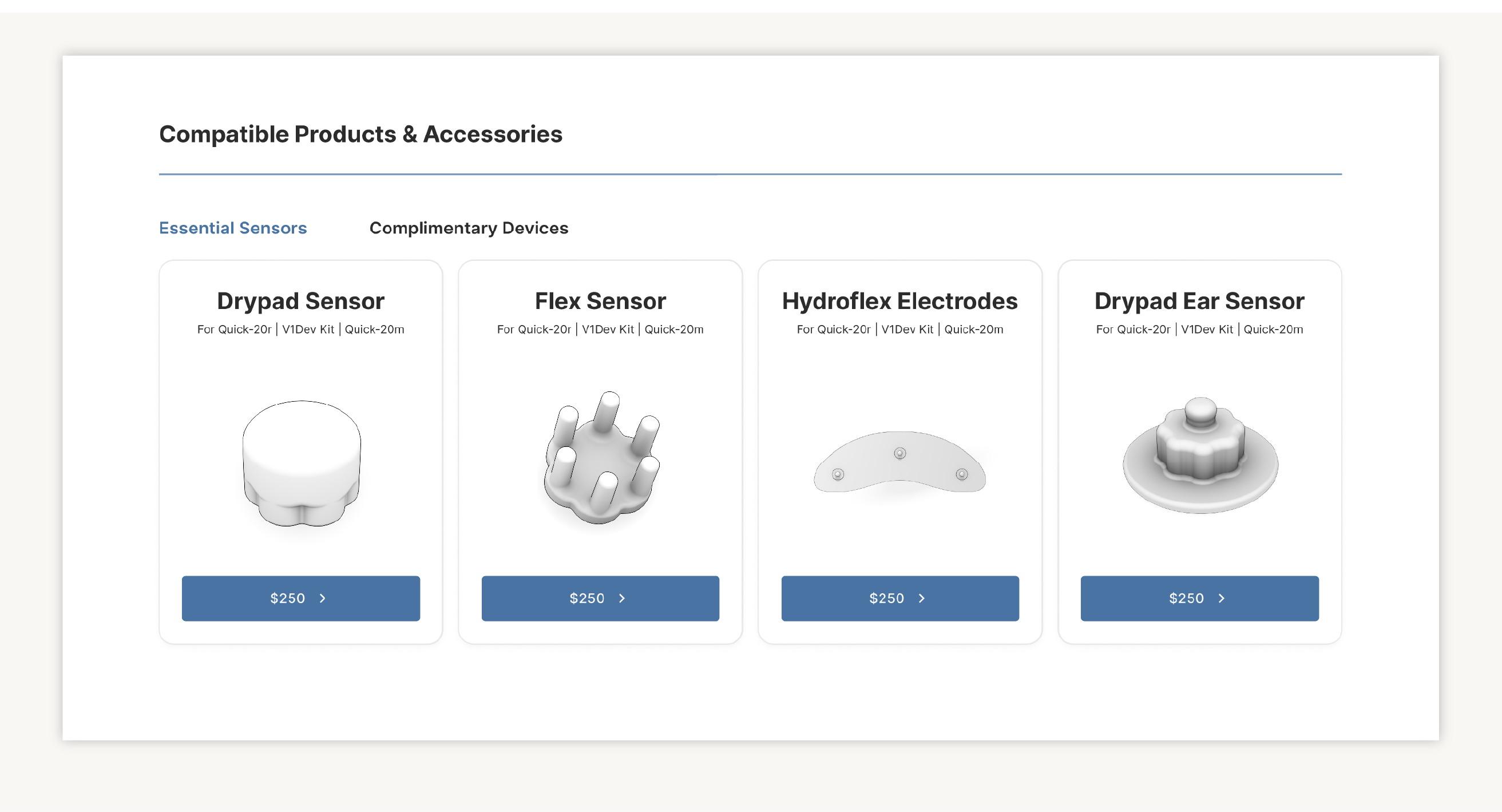
The revised page layout then works seamlessly as a reusable template structure for any other CGX device.
To make this template work correctly, I created a new suite of custom components tailored to the branding of CGX.

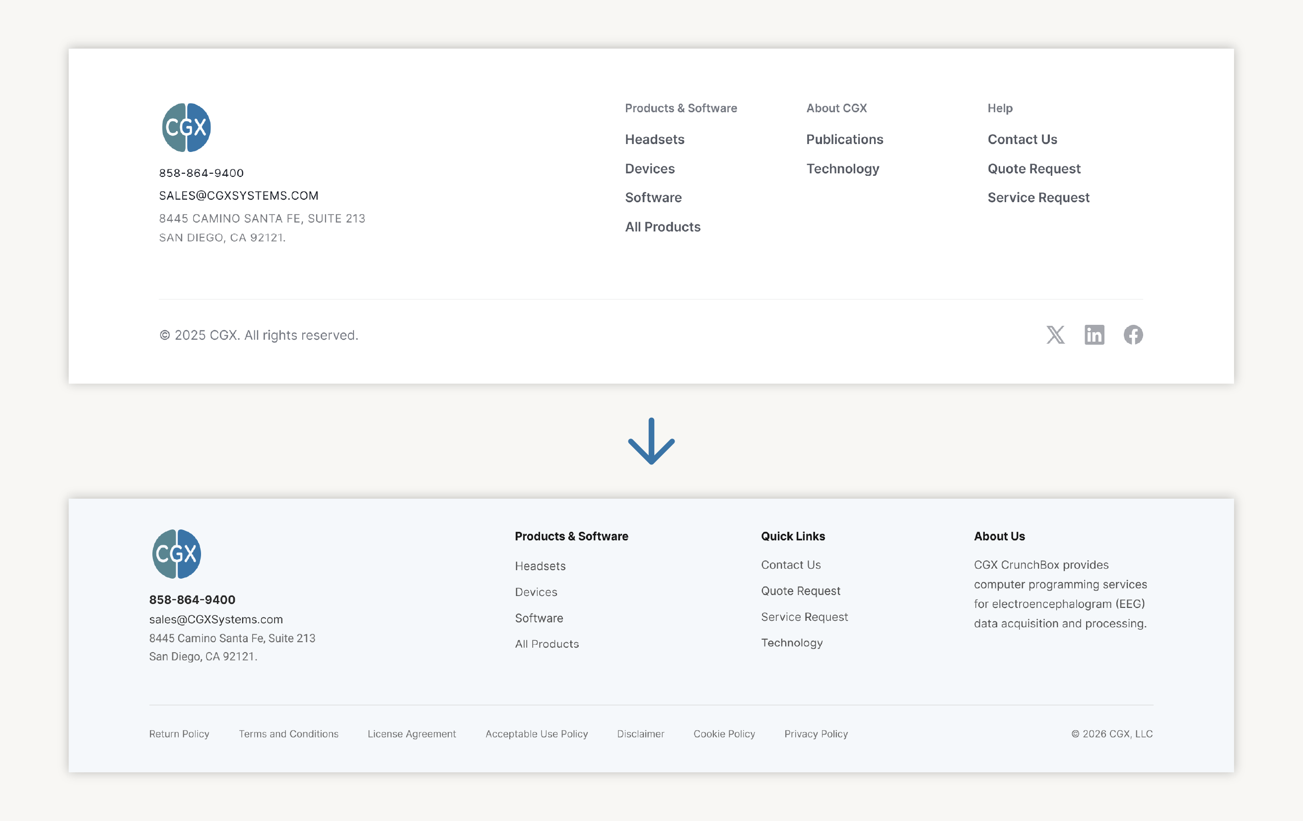
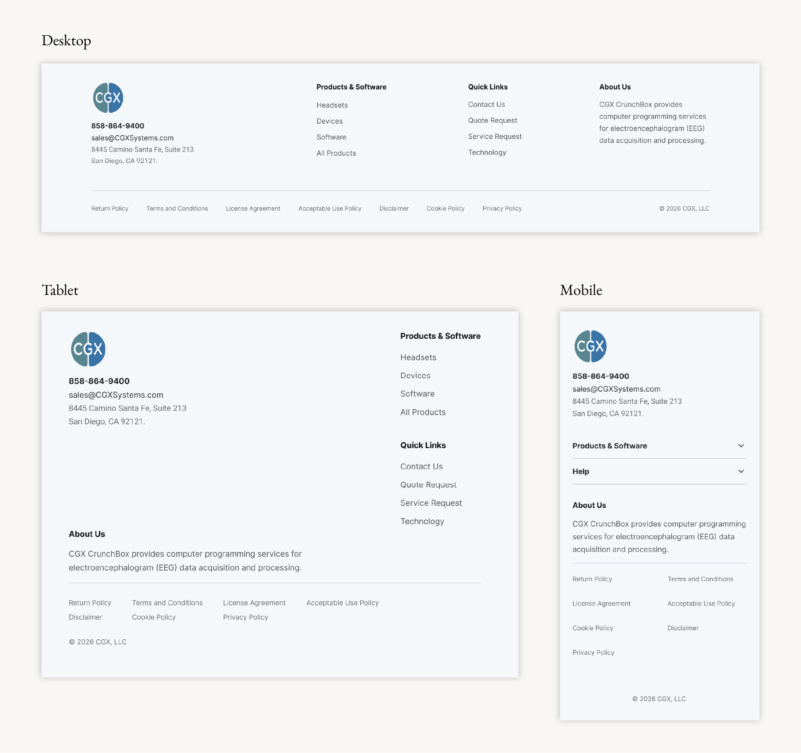
The original footer had column structure but no legal links and just a stray About section. The redesign added Brand & Contact, Quick Links, a real About Us description, and a full legal row, plus collapsible accordions for Products and Help on tablet and mobile.
The old footer's only responsive behavior was collapsing into one long, undifferentiated accordion, everything crammed into a single list regardless of importance. The rebuild treats each breakpoint deliberately: four columns condense to two on tablet without losing structure, and on mobile only Products & Software and Help tuck into short accordions, while contact info, About Us, and legal links stay visible instead of getting buried in a scroll.
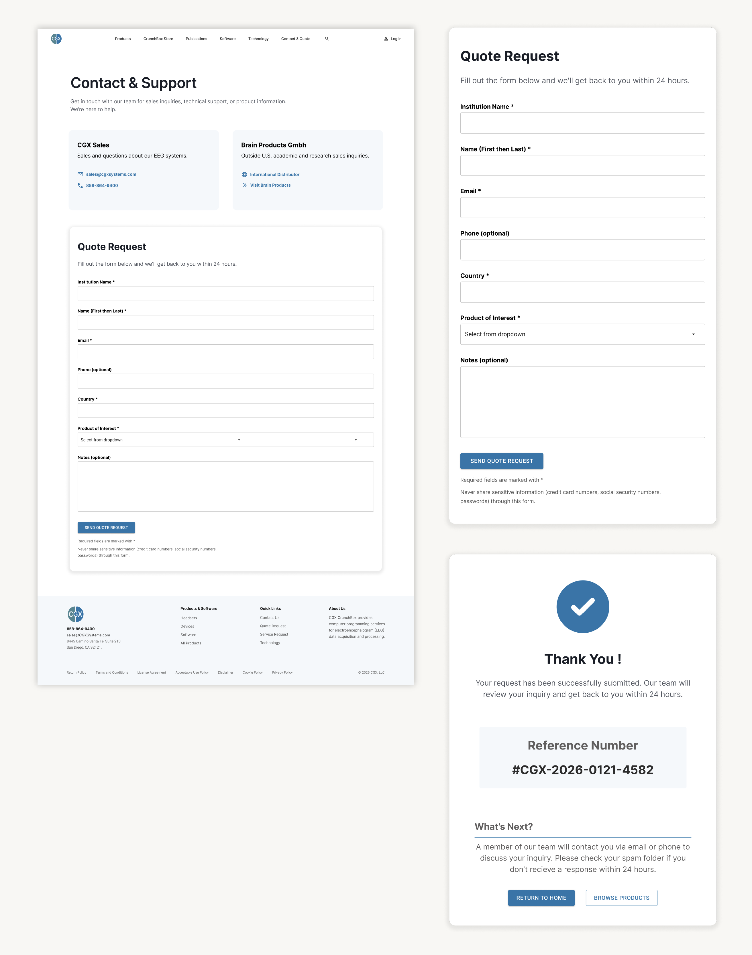
Contact Page
I designed the Contact Page as the moment research turns into an actual inquiry, so it needed to feel as considered as the product pages leading to it. I led with distributor cards so buyers know who they're talking to before filling anything out, then ordered the form around real buying logic, institution and contact info first, country for routing, product of interest, notes optional and last. The CTA reads "Send Quote Request" for clarity, and submission ends in a full confirmation screen with a reference number and two clear next steps instead of a dead end.